
:quality(75)/cloudfront-us-east-1.images.arcpublishing.com/elcomercio/GI3DCMRNGAZS2MRWKQYDAORSGY.jpg)
The one you see above is a pie chart, sector diagram, or circle graph, also called a pie chart, pizza chart, pie chart, balloon knot, pie chart, cheesecake chart, or 360° chart… many names for something that, when it was created, was despised.
It was the Scottish political economist William Playfair who created the world’s first pie chart, as well as some of the first line and bar charts.
LOOK: The syndrome invented by some Italian doctors that saved dozens of Jews from the Nazis
But while data visualization is ubiquitous today, when Playfair first introduced it more than 200 years ago, the idea of using shapes to illustrate numbers was not well received.
How could the drawings actually represent sound scientific data?
Why not!
Over time, data visualization became an art form.
And among that crowded universe of graphics, we chose the following 5 because they changed, in their own way, the world.
Dot Maps of Doctor Snow
One of the best known uses of data visualization was devised in London in 1854.
At the time it was widely believed that infectious diseases such as cholera were spread through the air.
The surgeon John Snow believed otherwise: he was convinced that infections could be spread by dirty water.
When a deadly cholera outbreak occurred in London’s Soho neighborhood, Snow tracked down each case and marked it with a dot on a map.
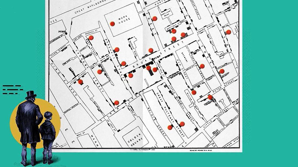
The picture that emerged was clear: all the cholera deaths were clustered around a water pump on Broad Street.
When he presented his findings to local officials, the pump was shut down and the outbreak ended.
Dr. Snow fundamentally changed our understanding of microbes, and his simple dot maps played an important role in the process.
The Rose Diagram
Around the same time, the “lady with the lamp” Florence Nightingale used a clever image to save even more lives.
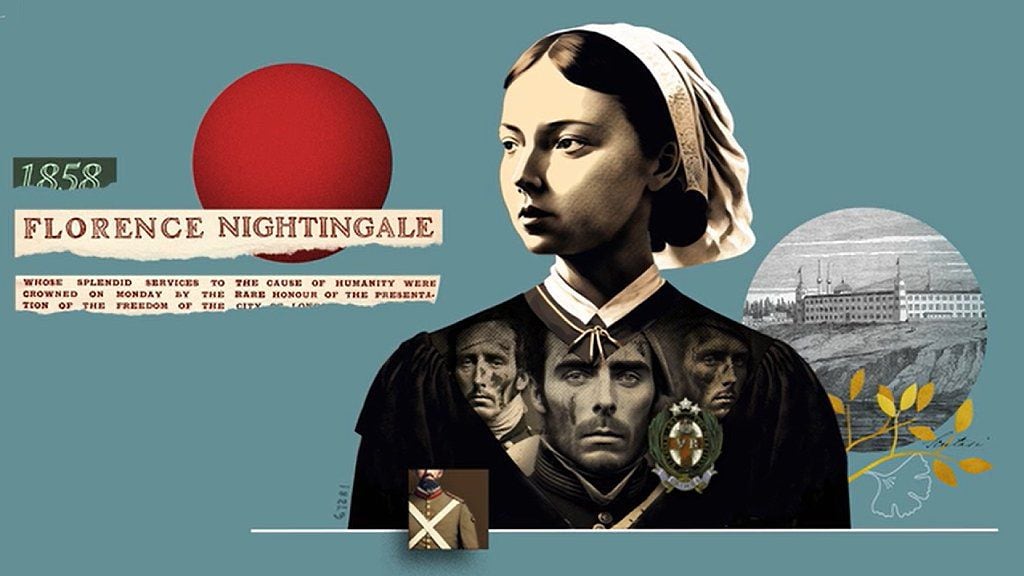
During the Crimean War, he realized that unsanitary conditions in hospitals were killing more soldiers than were dying on the battlefield.
He wanted to persuade Queen Victoria, head of the British Army at the time, to fund better conditions in military hospitals.
So he created the “Coxcomb,” which translates to cockscomb or jester’s hat, but is known in Spanish as the rose diagram.
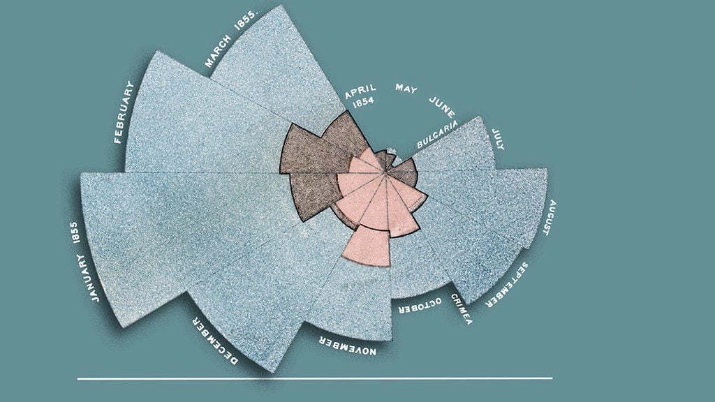
The ragged pie chart displayed data on the causes of soldier deaths in a highly effective way.
His efforts had a radical impact, not only improving the sanitary conditions of military hospitals at the time, but also changing the face of modern medical care.
the black truth
One of the most original examples of data visualization was created by the American historian and civil rights activist WEB Du Bois, for the 1900 World’s Fair in Paris.
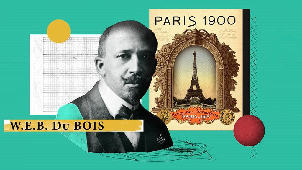
DuBois presented a series of hand-drawn charts showing the educational, social, and business achievements of black Americans in the 35 years since slavery had been officially abolished.
The information challenged stereotypes and illustrated how black communities continued to be discriminated against.
DuBois hoped that the visualizations would help end racial prejudice in the world.
“The problem of the 20th century is the problem of the color line,” he wrote.
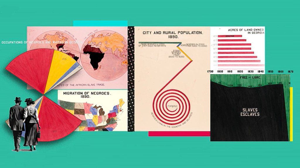
Although his dreams did not come true, DuBois’s beautiful graphics are now recognized as a powerful use of data visualization to demonstrate social change.
The Kallikak Tree
Visualization can also be used for misinformation, sometimes with disastrous consequences.
This is the Kallikak family tree.
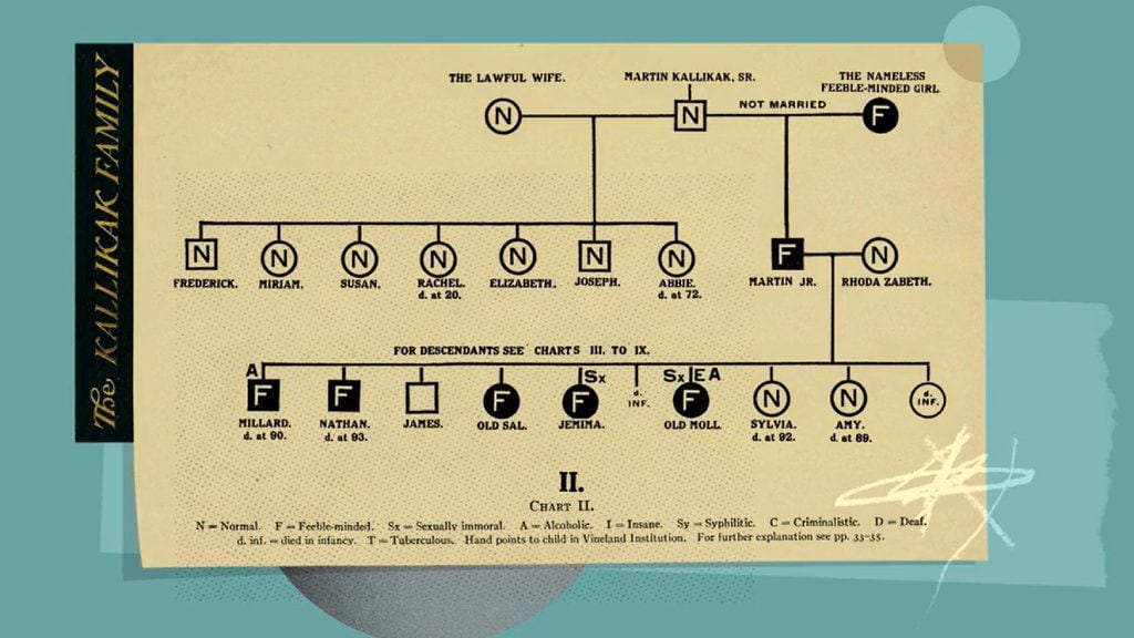
As a graphic, it’s not groundbreaking, but its impact was profound.
It was created on dubious grounds by Henry Goddard, an American psychologist and eugenicist who believed that one of society’s biggest problems was “feeble-minded” people, basically anyone he and people like him considered less intelligent.
Goddard wrote the book “The Kallikak Family: A Study in the Inheritance of Feeblemindedness”, based on the story of Martin Kallikak, a soldier who was married and had a family of upstanding citizens. But, according to the book, Martin Kallikak had a son from a one-night stand with a “feeble-minded” waitress.
For Goddard, “feeble-mindedness” was hereditary, and his offspring were full of what he called the “lowest types of human beings.”
But it was a fiction. The waitress never existed.

Even so, the Kallikak family tree could be found in school textbooks until the 1950s and was also used by the eugenics movement for decades afterward.
And it was adopted by the Nazis, who used it in propaganda films to rally support for their racial purity laws, which led to the murder of thousands of disabled people in the Holocaust.
heat streaks
Sometimes iconic status can be achieved almost accidentally.
In 2018, scientist Ed Hawkins was invited to give a speech on climate change at the Hay literary festival in Wales.
He needed to explain rising global average temperatures to a largely unscientific audience, so he devised a graph that used no words, just colors.
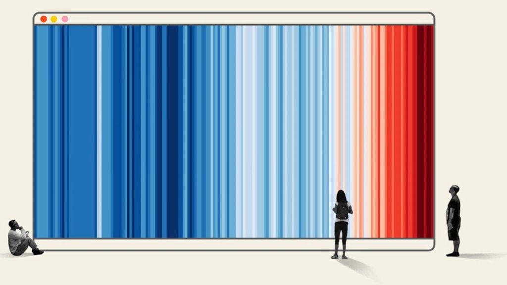
It was an incredibly simple way to show how the planet had warmed since 1850.
The chart, known as the “warming streaks,” uses blue to indicate colder-than-average years and red to show years with higher-than-average temperatures.
It’s been updated every year since then, and in 2022 Hawkins said it was the first year every country needed a new red stripe, showing just how fast Earth’s climate is changing.
Although the chart breaks some of the rules of data visualization (it doesn’t provide a title or legend), it’s one of the most iconic charts of modern times.
* This article is adapted from the BBC Ideas video “Five charts that changed the world”, animated by Adam Proctor. To seeClick here.
Source: Elcomercio
I am Jack Morton and I work in 24 News Recorder. I mostly cover world news and I have also authored 24 news recorder. I find this work highly interesting and it allows me to keep up with current events happening around the world.

:quality(75)/cloudfront-us-east-1.images.arcpublishing.com/elcomercio/HVKHEAEGJVDH7ITEZECXDZHDWU.jpg)
:quality(75)/cloudfront-us-east-1.images.arcpublishing.com/elcomercio/3Y5UCERRZZFS3I7MZUEFEOHG4U.jpg)
:quality(75)/cloudfront-us-east-1.images.arcpublishing.com/elcomercio/5FK22BPG6BE4BCPEXITJWHEKJU.jpg)
:quality(75)/cloudfront-us-east-1.images.arcpublishing.com/elcomercio/HOYENPQGXND6NGQBIWOH4O5QX4.jpg)
